Readercon 12 2000 Souvenir Book
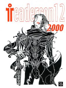
Illuminations on a Pale Prince
The first place I ever read about Michael Moorcock, or, specifically, Elric, was in the paperback edition of Sam Lundwall’s Science Fiction: What’s It All About? (1969). As me ever-dimming memory recalls, it alluded to some vaguely homoerotic, not to mention vampiric, relationship, he (Elric, not Moorcock) had with the sword Stormbringer. The character sure didn’t sound like the usual run-of-the-mill Bran Mak Morn…
The first time I ever actually read something by Michael Moorcock, it was the Elric story “Kings in Darkness” in L. Sprague de Camp’s collection The Spell of Seven. It was also the first time I had ever heard the name or seen the mastery of FINLAY. The illustration facing Moorcock’s story (which originally was done for something else which probably ran in Famous Fantastic Mysteries) was of a skeleton on fire. A skeleton that looked to be made of jewel-encrusted snow…
Elric has been described at times as resembling bleached bone lit by the fire of his ruby eyes and PAIN… He is naturally then an alluring subject for any and many delineators of phantasy. Jim Cawthorn was one of the earliest, and being a sometime collaborator with Moorcock, probably one of the most accurate. Jeff Jones has painted several covers showing Elric to be worn and haggard, denoting a subtle palette of feeling behind Jones’s usual muted chromatic brilliance.
Wendy Pini did her masterwork in a series of sketches and paintings for a proposed animated feature, which were fortunately collected and published when the project fell through.
P. Craig Russell and Michael T. Gilbert almost simultaneously fixed the image of the Melnibonean for the popular audience in sequential art adaptations. While I like Barry Windsor-Smith’s brief depiction of him in Marvel’s Conan, it was more for Smith’s fine linework than for capturing the true spirit of the character. The same goes for Michael Whelan’s paintings. Rodney Matthews turned armor virtually into exoskeleton, and that was a more interesting take.
Noted illustration historian and artist Richard Schindler singles out Robert Gould as doing his favorite version and there is a flavor to his dustjacket designs of…bleakness? Retaining something of the ornate.
In another medium, Hawkwind successfully mounted a stage presentation of The Chronicles of The Black Sword. Successful because Dave Brock and Co. rock me own little world no small measure, but I digress…Of course black metal bands in Norway such as Emperor and Dimmu Borgir have made their own visual and sonic tributes to “The Lords of Chaos”…
The cover to my Lancer copy of Stormbringer is my personal choice for someone’s depiction of Elric—I believe it to be by Jack Gaughan. The sword is almost as big as Elric, thicker than his arms or legs, which are encased in thigh-high leather boots. He wears a peaked helm resembling a giant thorn matching the spiky minarets of the Dreaming City silhouetted against an autumnal sky. A white metallic rose that can shatter at any second…
Fragility. Strength. Beauty. Horror. Elric has also been labeled an “anti-hero,” but I have never been quite able to view him that objectively. A “Multiverse” reflection of…ourselves? Perhaps. I know doing a depiction of him was the hardest assignment I ever gave myself. But at the very least, this sad, sweet, pale prince will at least remain a diamond embedded in the frost of childhood memory.
“Three Kings in darkness lie,
Gutheran or Org, and I,
Under a bleak and sunless sky–
The third Beneath the Hill.”
Submitted by
The joey Zone
Needle Gunner, Hawkwind Army
The Book of Weirdo, coming Fall 2018 from Last Gasp Publishing
When The Going Got Weirdo 1985: It is seven years before Art?Alternatives debuts full colour lowbrow kustom hijinks on better stocked newsstands (nevermind an additional two years before the inauguration of Juxtapoz). You can’t order your favorite indy ZINE off the nascent Internet as Amazon wouldn’t get up and running until 1994 either. Thankfully Mike Gunderloy’s Factsheet Five served that purpose in print, and as some of us would argue, with a more sychronitic and pleasing aesthetic.
Pre-DeviantArt, when you had to hit the street corner to get your underground art fix, Weirdo is one of the few suppliers in town, already in it’s fourth year of publication.
I first picked up a copy of the magazine at Ziesing Bros’ Book Emporium which could best if inadequately be described as a lovingly missed Magick Theatre for The Literate. One of my favorite covers was for #3, heavily riffing on a Humbug-inspired border layout including among other kultural icons, William Burroughs and Sue Catwoman. I forget what issue announced The Ugly Art Contest but I was ALL IN.

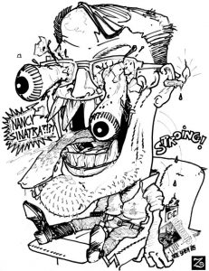
2018: It is thirty-three years after Weirdo #15 came out, with my offering, reproduced at a ninth of a page, accepted by cranky indy GOD and then current editor Peter Bagge. It played on the same level as an artist whose work I love, XNO (Chet Daumstaedter). The Grand Comics Database details that section of the issue as “Twenty-five illustrations featuring “ugly artmanship,” some of them quite influenced by Basil Wolverton.” And they would be correct! at least in my case (Wolverton, then Roth, then Williams, then XNO, then…). Underneath some optically exuberant slacker in engineer boots (Bagge[?] notes: “Them boots are made for walkin’, Joe!”) has a reverie (probably after falling asleep to NANCY & LEE on the Victrola) and drops a copy of the zine Damp in the process. Earwax from burning it at both ends no doubt.
Weirdo was one of the first publications to validate my work and that of others in varying degrees of proficiency and talent.
In the 1980s, a ‘web presence’ didn’t mechanically communicate that talent or your art, some editor who believed in you did. When the going got Weird, The Weirdos…got published. Baby we are fine artistes. And maybe we deserved to be kissed.
—The joey Zone
